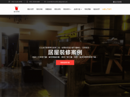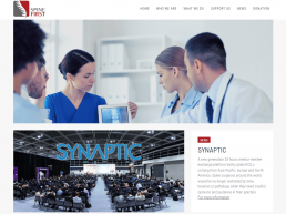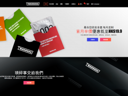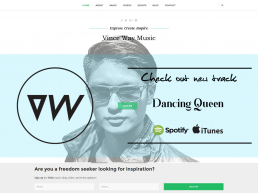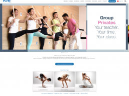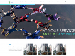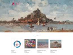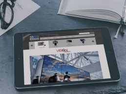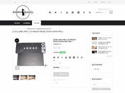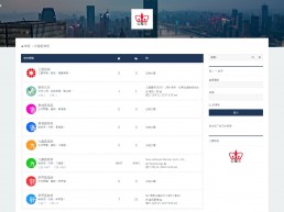
Screenshots gallery
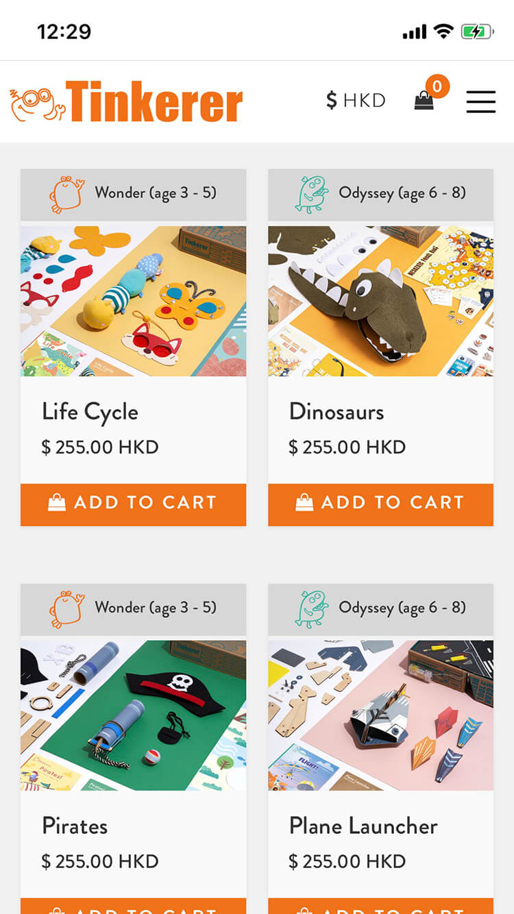
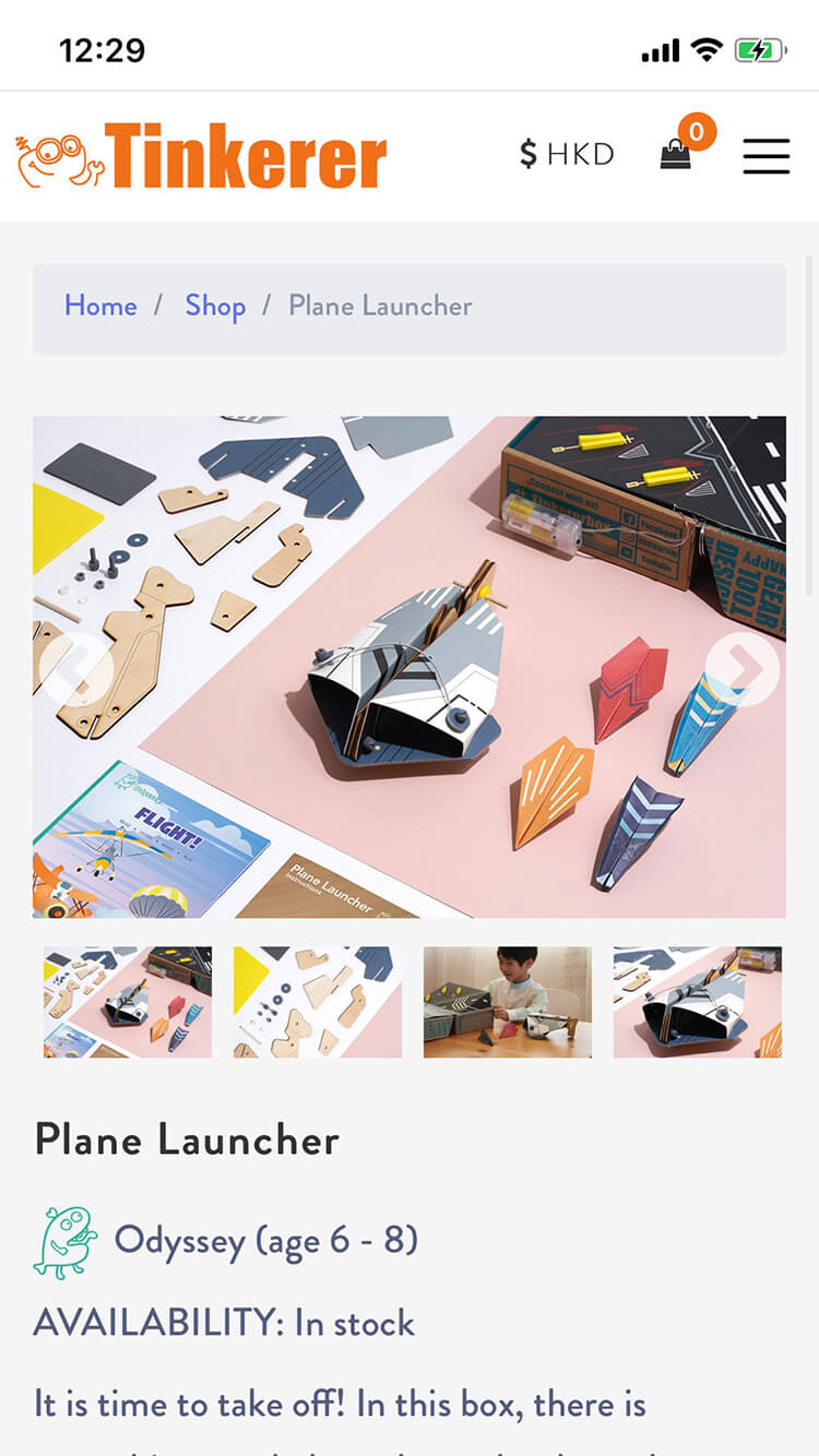
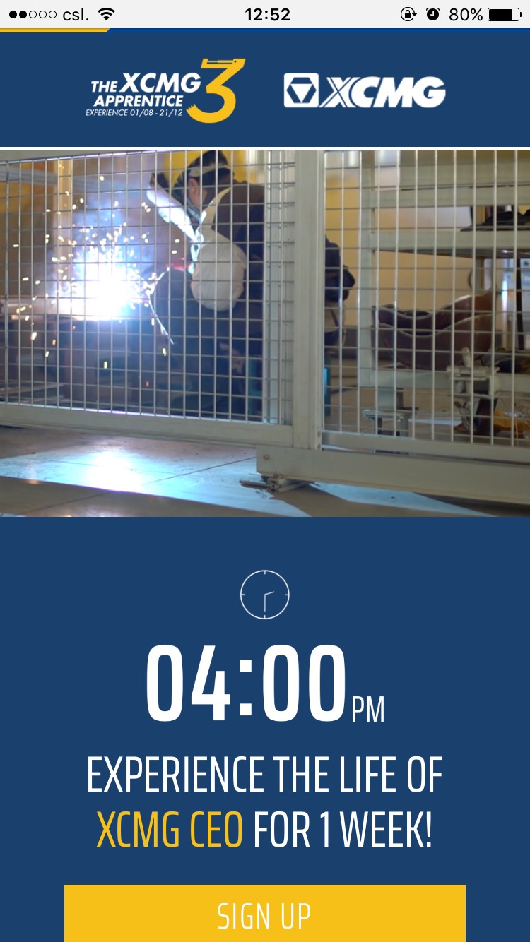
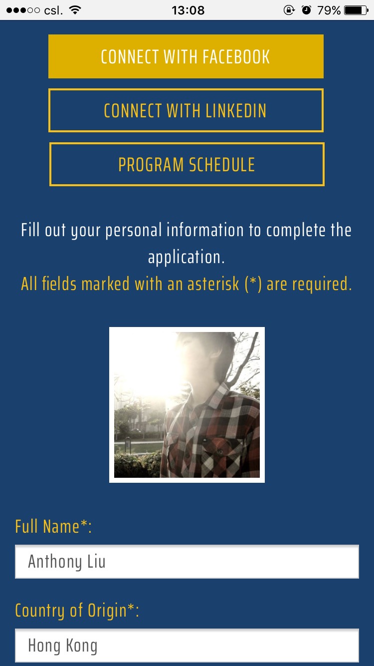
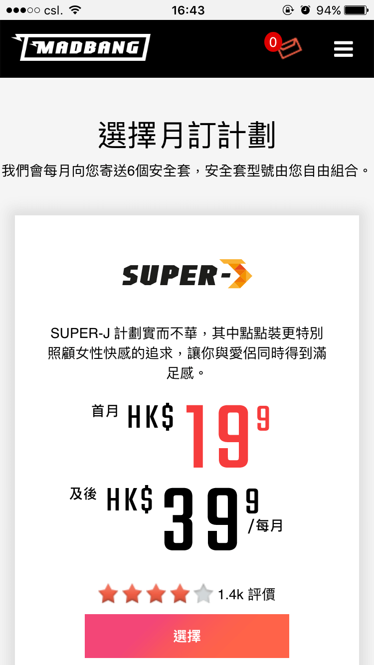
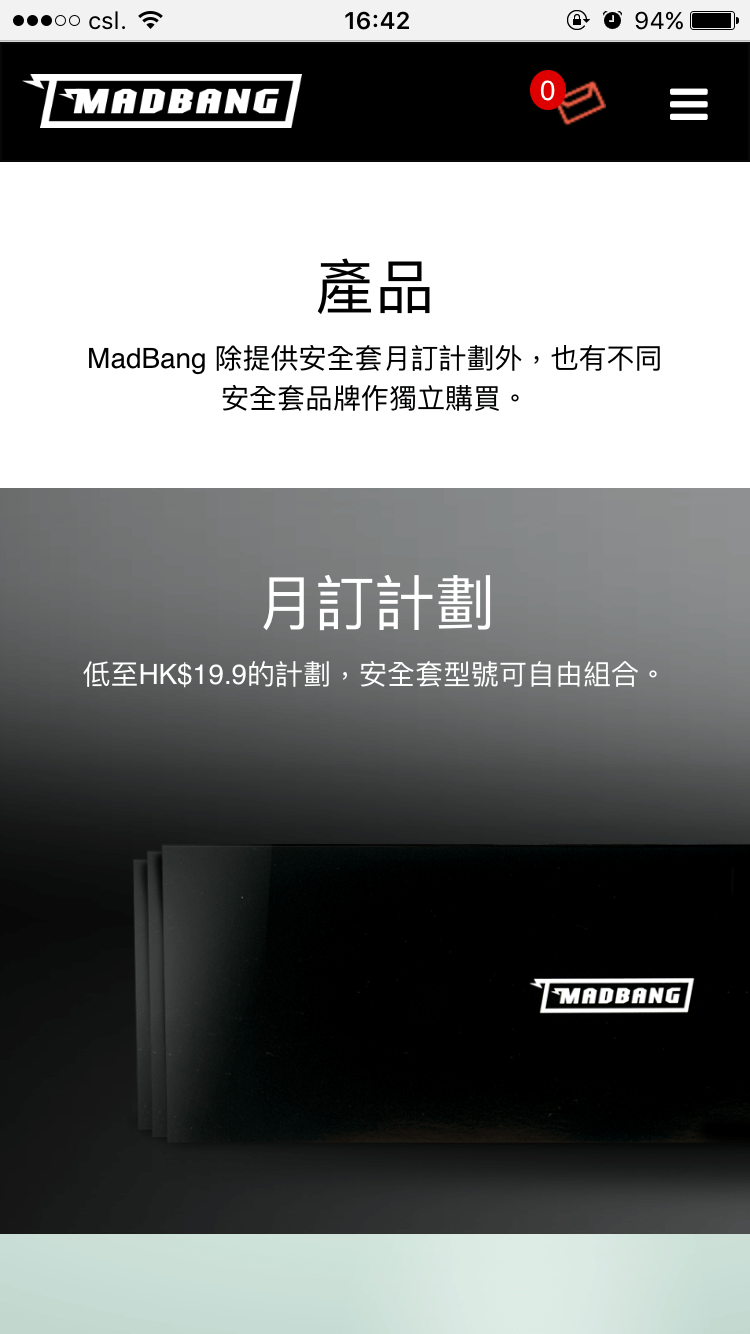
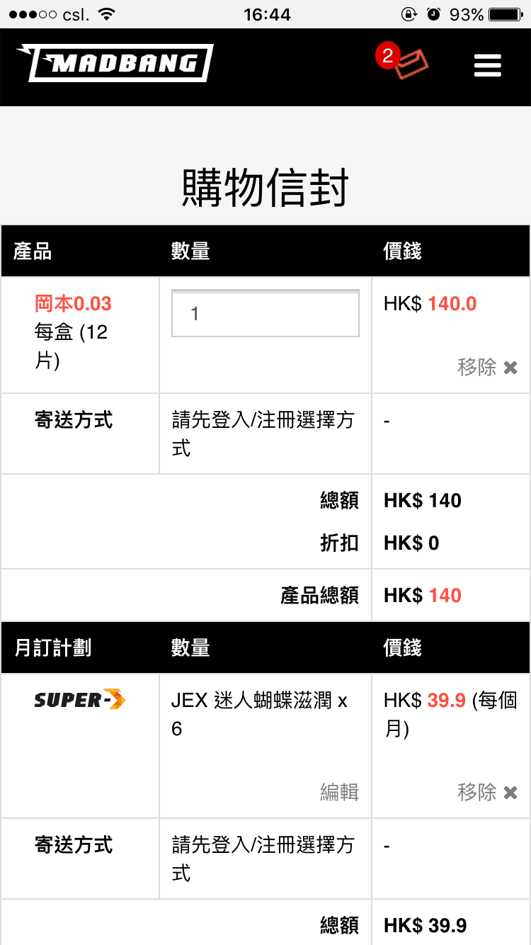
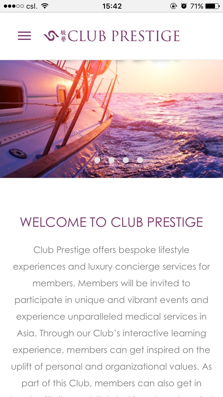
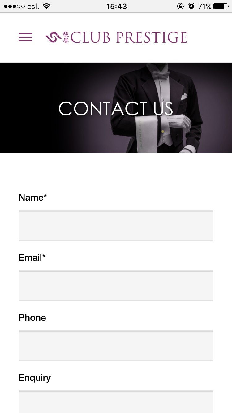
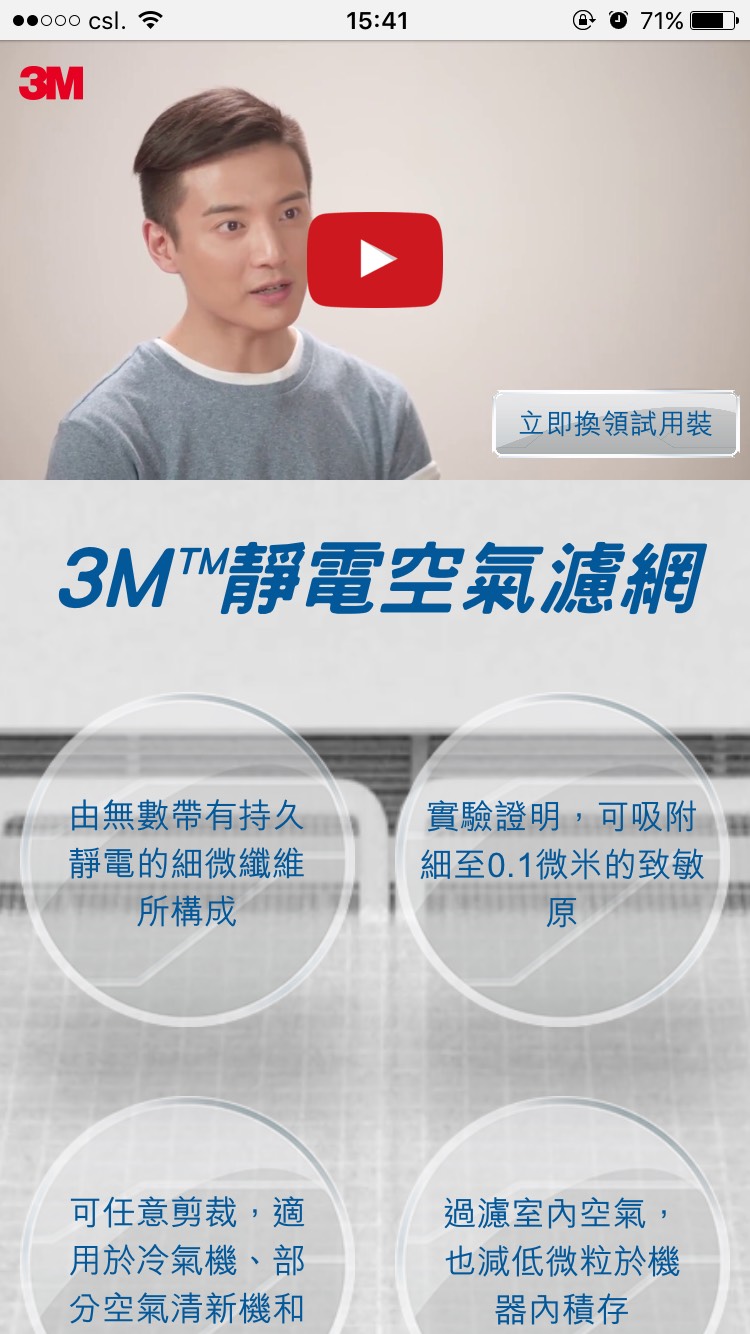
Let's take a look at the mobile view, as most users do.









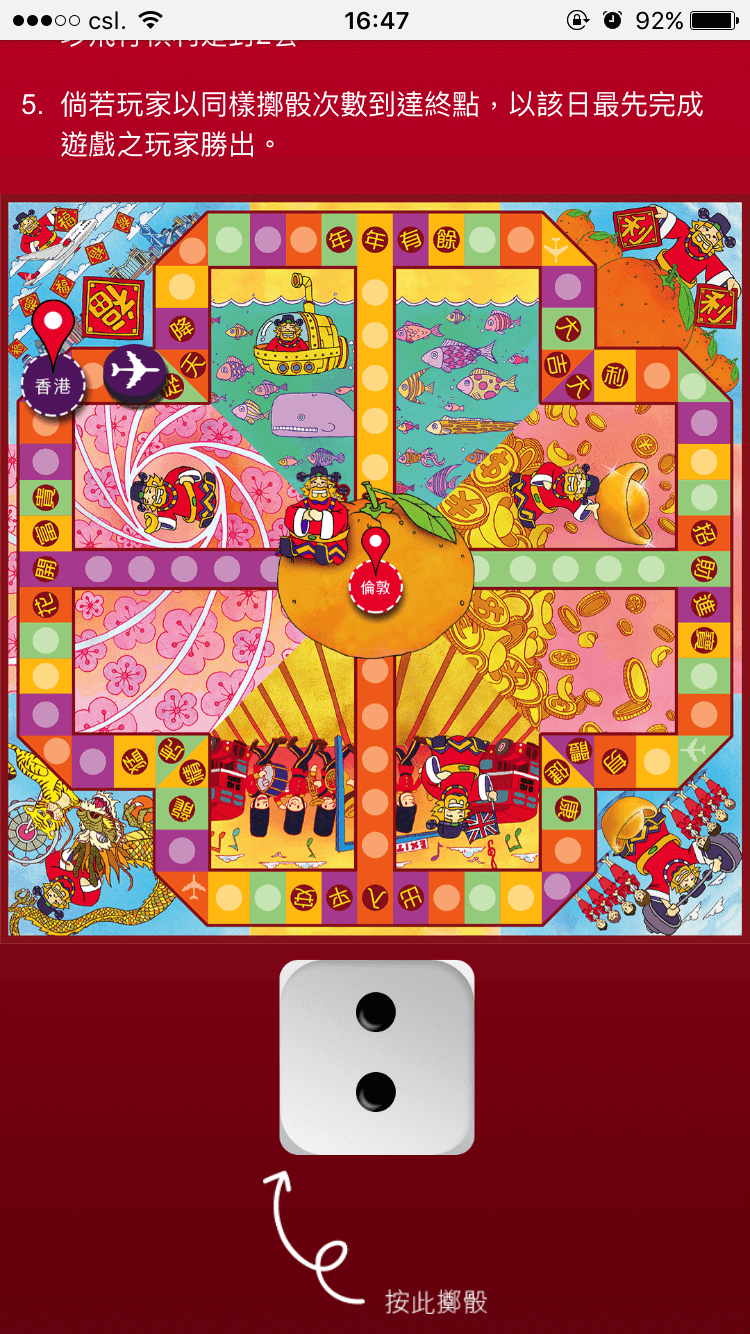





Mobile Responsive
All website are mobile responsive which means they can be viewed with your desktop, mobile or tablet.
Advanced Grid
The size of the elements will change according to the size of your screen to ensure best view of the website.
Perfect Design
Viewing the site in any device will a great experience as the elements are tuned perfectly for your view.
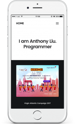
Top Performance
Site that are build from scratch have the top performance as the functions are build without redundant code.
Sleek & Minimal
Acquire only the most important element and made into simple elegant objects available.